|
Plotting the
GFS (AVN) Forecasting Model
|
Home
NB: Please read my "Understanding Weather Model Basics" guide if you are new to all of this,
here
The AVN (Aviation) Model or GFS Model as its now called is a good forecasting model for all sorts of weather events. Learning how to plot your own variables allows you to get a lot more out of a forecast than what you might otherwise view in a simple model or text forecast. For example, you can view upper level long wave patterns ( this can help in forecasting potential cold fronts), humidity throughout many different layers, temperature throughout the atmosphere, winds etc. It can all seem a little confusing at first but in a way, its like riding a bike, wobbly initially but over time it becomes easier. Below are some links to the GFS (AVN) Model, they are sometimes down due to the huge demand on these servers so be patient. In this example, I will show you how to plot the Long Wave Trough and give some basic hints on how to interpret the resultant chart. You can also use this information to plot other variables, as you learn about them. I will be referring to the GFS (AVN) Model here but other model plots are similar. It might be an idea to open the GFS (AVN) link in another window, whilst reading the information below.
Main GFS (AVN) link
More Model links if above link is down
First, a little about the Long Wave Trough.
The Long Wave Trough is an upper atmospheric phenomenon that is the result of an unevenly heated,
rotating sphere - the earth. We can obtain a better idea of the LWT if we view an image of it.
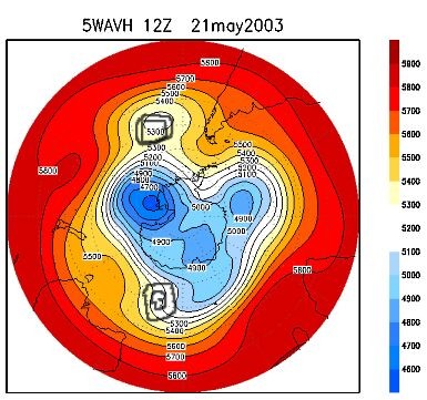
You are looking at an image of the Southern Hemisphere with Australia upside down near the
bottom. Now have a look at the lemon coloured line marked 5400 and observe how it meanders its
way around the globe, moving up and down in waves. These long waves are in the upper atmosphere,
this is the region that drives and strongly influences the weather at the surface. Its when these
long waves peak over the south east of Australia and short waves move into them that good surface
weather patterns favouring cold outbreaks can form. You will see my roughly drawn versions of
potential short wave patterns (the black circles) moving into the long waves. Imagine the long
waves as ocean waves peaking and breaking onto the shore. When these long waves peak and "break"
onto the south east of Australia with short wave patterns within them, you then have potential
for cold outbreaks. You can see in the image above that a long wave is peaking to the south-west
of Perth (the 5400 yellow line is roughly where the LWT is, also with my drawn, black short wave).
This means that the strongest frontal weather would typically form near Perth underneath this
long wave/short wave pattern and the Central Tablelands would miss out on the strongest fronts.
The LWT typically moves east very slowly at around 8 knots per day but can remain stationary or
even move west (retrograde). Shortwaves within the long wave patterns tend to move east
proportional to the average wind speed at the 700mb level.
Anyway, that is a very brief introduction to the LWT, so at least you can plot it with a little
bit of background knowledge. If folk have more to add or to correct, please feel free to email
me. Lets plot!
Plotting the LWT on GFS (AVN):
After clicking on the GFS links above, you will be greeted with the first page of the
forecasting site. You should see the following headings: (formats may change slightly over time)
"Control File": Select the latest date and time available here. Remember, times are in UTC
(Universal Time Coordinated) so you need to make a mental note that Australian Eastern Standard
time is ten hours further on from UTC, eleven in summer.
"Options": Just click on "Include Variable Definitions and Units."
"Plot Type": Map should be selected.
Click "Next Page"
On the next page...
"Variable" Under this heading, click "5WAVH".
Then scroll down to the "Time" option and select your desired time (I select the earliest time
of the run so as to get the current Long Wave situation as opposed to possible situations
later in the run but its up to you and your interests)
"Map Projection" box. Click on the box/arrow immediately to the right of this and scroll down
the box until you get to "s hemi" (southern hemisphere). Select this and ignore the other boxes to the right of this field. You can fiddle with custom settings for plotting other variables at another time.
"Draw" select "Shaded and Lines" for a clear rendering.
Then click on Plot and your away! :)
Home
|